Last week, I spent some time sorting out some 1990s sets and ran across a stack of 1994 Topps Gold cards. These per-pack-parallels were so much better than the one-per-box Topps Gold cards that current populate the Topps flagship product.
Let's take a look at the 1994 Topps Gold Ray Lankford card.

The difference between the Topps Gold and base cards in the 1994 flagship set are simple. There is the logo on the top left corner of the card and the player name in the bottom left. On the base card, both are white, while they are Gold Foil on the Topps Gold card. Simple changes, but they make for a nice looking baseball card.
I don't want to take away from this great looking Ray Lankford card, so I am not going to post a modern Topps Gold card, but if you have never seen one, the border of the card is gold foil. It's a bit much.
Beyond the gold foil, I love the action photograph of Ray Lankford on the front of this card. Almost positive that this is in Wrigley based on the dark green background. I wish it were a little less blurry, but I cannot think of another mid 1990s baseball stadium with dark green walls and grass.
Back of the card.
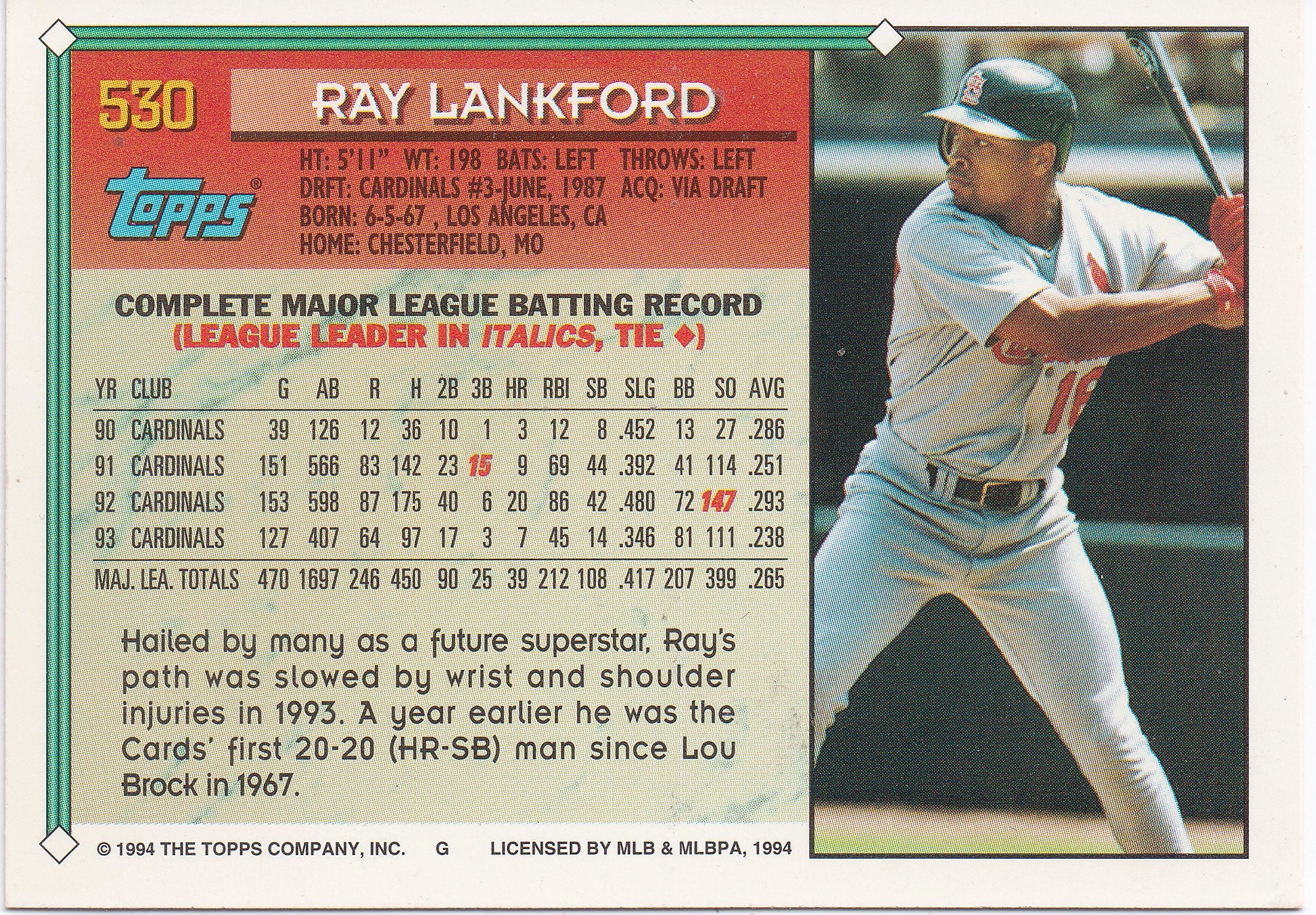
Standard Topps baseball card stats and biographical information. I like the little photo on the side and the little write-up on the bottom. Any time you get a write-up that compares Ray Lankford to one of the all-time franchise greats, or a Hall of Famer, I am going to be a fan. Lou Brock and Ray Lankford sound good in the same sentence.
I know this is one of the Topps least popular base sets of all-time, but I honestly don't mind. It's not the 1983 or 1984 Topps set, but it's also not 2001.


I haven't opened a box of flagship Topps in quite some time... but it's kind of refreshing to hear that they only insert one of those gold parallels per box. I miss the days when you pulled a parallel out of a pack and you felt like you were holding something special.
ReplyDeleteI miss the old Topps Gold cards too. It would be nice to see them return, but I have a feeling Fanatics is going to steer the company in the opposite direction.
DeleteI didn't realize that this design was disliked so much. It's not a favorite of mine, but I don't hate it either. And compared to some of the designs I've seen in recent years, it's really not that bad.
ReplyDelete