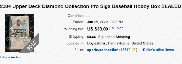
If you were looking for a really bad early 2000s box of baseball cards, look no further than the Upper Deck Pro Sigs set. The boxes were dirt cheap and came with a bunch of overly busy baseball cards and one really bad autograph.
Why would I post such a card?
We all need a good disaster movie every once in awhile.
I opened a box of Pro Sigs, but it was in 2007 when one of the many failed cards shops in the greater Raleigh-Durham metro area went belly up. Specifically, the baseball card shop that was overrun by high school Pokemon collectors on Duke Street in Durham. I don't even remember the name of the place these days. I believe the box cost me $20 and I pulled a Luis Rivas autograph. At least Luis was on the Durham Bulls at one point during his long and winding career. People are crazy for old wax boxes online these days, but apparently people still know that UD Pro Sigs is terrible.
Probably $25 too much considering you could just go buy one of the autographs from this set on COMC or Ebay for less than $5 and the complete set is sitting at someone's flea market booth for $3.
Back to Albert Pujols and the Pro Sigs cards.
Here is the front.
I like the photo of Pujols on the front of this card and I also like the silver background. The bottom half of the card is just a complete disaster. First, Albert Pujols did not sign any cards for this product. We don't need a shaded in red box with a gigantic faux-signature of Albert. Second, the Diamond Pro + Sigs Collection logo is far too big and looks ridiculous being stamped in the middle of the card. Those two design elements take up roughly 50% of the front of the card.
That's not good.
If you left the picture, the silver background, and the small name and team plate at the bottom, you'd have a winner on your hands. We can't go back now, so the front of Pro Sigs is a trainwreck.
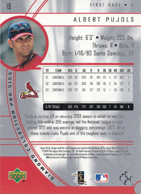
Back of the card.
The back of the card is much better than the front. Sure, the small picture at the top is recycled from the front of the card, but it's generally solid. You've got the standard Upper Deck stat box, which was always somewhat limited. I can still live with it. Decent sentence/write-up about Albert's 2003 season underneath the stats. I like the red, gray, and white color scheme.


I've never seen this set before, and I'd probably be okay if I never saw it again.
ReplyDeleteI promise never to post a card out of this set again.
DeleteI actually understand (not saying I love it though) the red box with facsimile signature. I mean... the product is called Diamond Pro Sigs. But you're right... the Diamond Pro Sigs logo is way too big and completely takes away from the card.
ReplyDeleteI wouldn't mind the facsimile signature if it was a stand alone design element. Lose the red box and just put it over the picture and I could probably go for it.
Delete