Play this music as you are reading.
It fits with the post.
Basic Design
How many sets did Upper Deck make like this in the late 1990s and early 2000s? Plenty. Relatively small checklist with a few short printed rookie cards at the end. Glossy finish. Mix in a few inserts, some "game-used" stuff, and a few autographs. They did the same set over and over.
A few of them have their own flavor, but many feel really cookie cutter in some ways.

The base cards have a picture with the player in a box, their name on the left side of the card, and this 1980s school film strip thing running across the bottom. Makes me want to search the closets at school and see if I can turn up one of those old projectors. I will use it all the time.
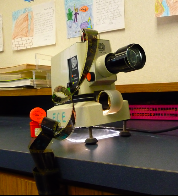
Ping. Move the film strip forward.

The back of the card also has a color photo, which comes into play when we get to the parallel cards here in a second. Really simple stat line, player name again, team logo, and the card number is printed really small at the top. Besides being a repetitive set that Upper Deck made over and over again under different brand names, the cards feel really busy to me.
Here is something I like about this set.


The cards are shown top to bottom. The parallel card is red, the blue card is from the base set. No serial numbers, and there are not fifteen different colored parallels, just two. The parallels just flip the front picture with the back picture and change the color. Upper Deck did this in other sets too. Seems like a simpler approach to a parallel set. At least, compared to the current insanity of parallel cards.
These were called "Reciprocals". Based on my stack of cards, you got a couple from each box. I think if they are going to use a math term for a parallel, they should have done more to incorporate the concept into the design. The base card should be numbered 11. The reciprocal card should be 1/11. Fraction card numbers.
Am I right? Someone who knows something about math back me up in the comments.
Favorite Former Durham Player
Hopefully you are playing the music from the top of the post.
Upper Deck made an Austin Powers inspired insert set called "Awesome Powers"
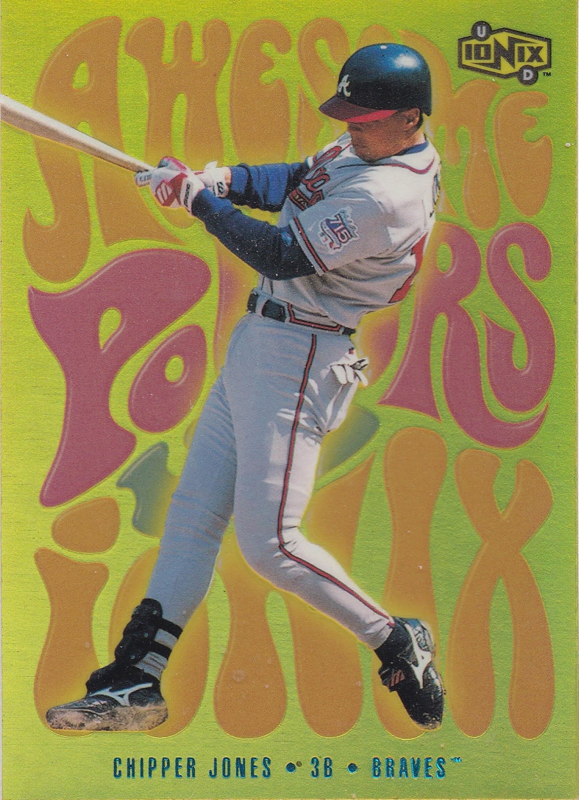
I have the Chipper Jones version of the insert.

This feels like a let down. A standard Upper Deck stat line on the back of an insert card? They should have come up with some sort of 1960s pop culture reference. Stop the music.
Favorite Cardinals Card
The choices in the base set were really sad.

The reciprocal card for McGwire is slightly better.

There is an Adam Kennedy prospects card too, but I did not even feel like is was worth the time to scan. I am actually going to go with this insert card of Mark McGwire. I guess if you are going to use math terms for the parallel set, mixing in some science on the insert cards is fair game. Periodic Chart of Players and McGwire was given the Mc label.

There is an actual Mc element.

It's a synthetic metal. Synthetic things and Mark McGwire. I think there is a joke there somewhere.
Favorite Non-Cardinals Card

MLB had this really bad promotion in 1999 where all of the teams wore "Turn The Clock Ahead" uniforms. Several of them appeared on baseball cards around this time. Truly amazing that anyone thought these were a good idea. Beltran is pictured here wearing a Royals "Turn The Clock Ahead Jersey", but they actually had two different versions. The other one was far worse, and is shown in the highlight video below.
You don't even have to watch the video, just look at the picture on the preview. It's terrible.
Those Mariners jerseys in the video look similar to the Diamondbacks uniforms from two or three years ago. Whatever your favorite team, go hunt down pictures of these jerseys if you have not seen them before.
The "Turn The Clock Ahead" uniforms also gave us a classic Albert Belle moment. He had three home runs wearing his futuristic duds, but got hit by a pitch at the end of the game with a chance to hit a fourth homer. Belle stood at home plate and pretended the ball did not hit him.
Classic. Albert Belle.
I imagine at some point future generations of baseball fans will look at cards like this Beltran and wonder what he is wearing. "Gather around grandkids, let me tell you about baseball uniforms during the 1990s....."
Probably won't actually happen. I am glad that Upper Deck captured these uniforms on a baseball card for posterity. I like to look at it and chuckle.
Autographs, not inserts.
I could write about a bunch of the inserts that Upper Deck included in the packs of Ionix, but I won't do that today. Let's talk about the autographs instead. These were actually kind of a tough pull at roughly one autograph per case.
I have a Jeter autograph from this set. Pulled it out of a pack of cards.

It's the only one in my collection. If he were as good as someone, say Alan Trammell, I would probably be willing to own another one of his cards.
The design is not great, but it could be a whole lot worse too. I am not sure why there is a gigantic bar going across the card with the player name, position, and team logo written in really tiny font on the inside. Seems like Upper Deck is filling space for the sake of filling space.
I also have a Rolen autograph from this set.

I did not actually pull this out of a pack of cards. I just bought it. Love the flip down sunglasses.

So How Does It Rank?
Think about all the pros and cons on this set, along with all the other sets I have featured on the Set Appreciation Posts, I can confidently say that this set ranks second. So far.
2. 2000 UD Ionix
This list looks lame at the moment, but just wait a year and it will be better.
Did you collect this set? Do you have a favorite card?


I guess I have to go get the Awesome Powers set. Right up my alley! You are right about hte backs though, bummer.
ReplyDeleteI did not even look up the checklist for that insert set when I typed this up. Good list of names, it wouldn't be too expensive to pull off.
DeleteI definitely opened packs of this product. Can't think of a personal favorite, but that Jeter autograph of yours is awesome. Congratulations on that pull.
ReplyDeleteGwynn has one of those Atomic/Periodic Table cards, but the checklist looks thin for the players and teams you collect. Although, there is a Ben Davis autograph.
DeleteI had forgotten all about those uniforms, probably intentionally... thanks for reminding me!
ReplyDeleteAnytime, I love finding stuff like that on cards.
Delete