
The card section at my local Target is a hot mess. This was tucked into a corner along next to all of the odds and ends of the card aisle. I picked up a few packs along with a bundle of bananas and bottled water to help pull me through an awesome staff development at work. Here's a quick glance at the cards and a few thoughts on their design and the whatnot.

A lot of the initial talk with the 2015 Topps set has been focused on the design. It's different from the white bordered designs that has ran with for the better part of the past decade plus. 2007's black border and the blue borders in 2003 are the last two non-white borders that I can think of off the top of my head. This is a quick post, so perhaps I am wrong. I spent a little bit of time talking about the design with Jimmy, the owner of a local card shop, and we both agreed that the bottom is a little bit different. However, some of the parallels look really nice.

The gold parallels in particular are very nicely done. Clearly the patterns within the design are the same on the base and the gold parallel, but there is something nice about the color scheme on the bottom card. Topps also made a really nice home-like parallel for the 2015 set, but I am not sure how well this card shows up on the scan.....

The scan seriously does not do this card justice. The Topps Chrome product might be really nice this year. There are also some really nice insert cards in this the 2015 Topps set. The Opening Pitch set has been a pretty popular topic on Twitter and in discussion rooms, so I am going to leave that set alone until I show off the hits from a jumbo I am opening at my local card store. Here are a few other cool inserts.....
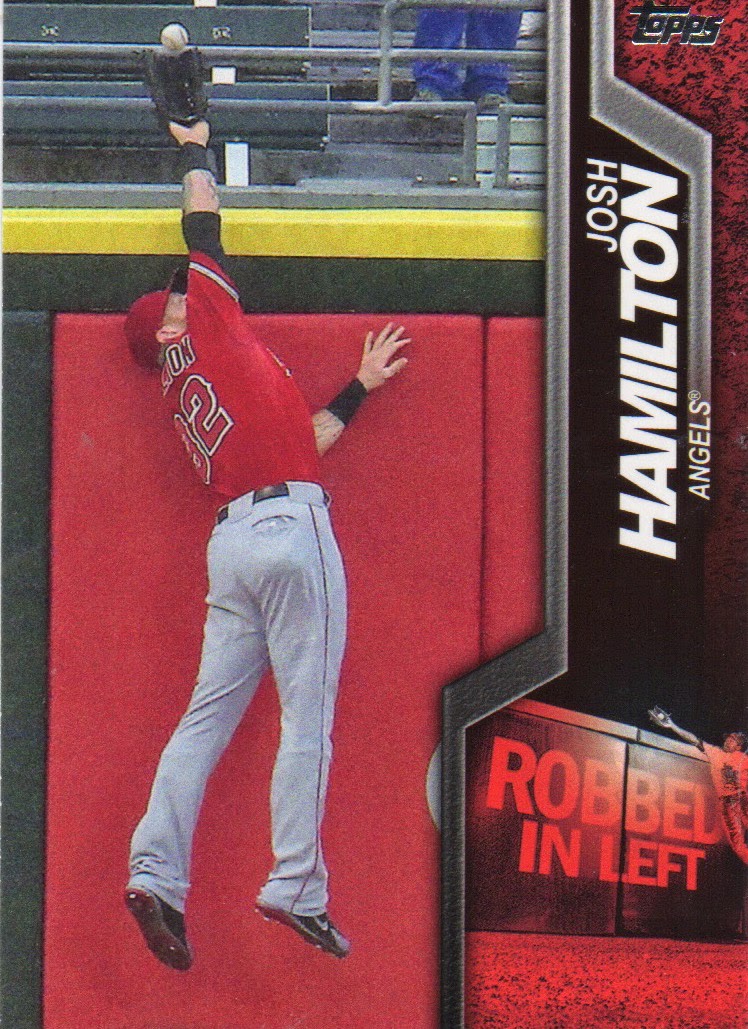
First, I have to say that any insert sets that highlight defense are always first rate. I pulled two of these out of retail packs last night and they are both outfielders. One centerfielder and Hamilton in left. Not sure if these are just outfielders or if they have them for all of the positions. Again, this is a quick right up and I am not going to go and look stuff up at the moment. Just remember, defense always makes a great insert set.

This set about Free Agents reminds me a little bit of the 2011 Topps 60 set. Really nice looking set and I like the cool picture on this card of Carlton Fisk in the 1980s White Sox uniform. Maybe this will end up being the coolest set in the bunch, but I am going to say this is going to be a winner of an insert set.

I almost made it through a post with no Rays and no Cardinals, but I am not passing by a Stan Musial card. Topps did a bunch of stuff last year with the World Series, but it appears that the theme might spill over into this year's set. This insert set is Highlight of The Year, many of which probably happened in the World Series, so again this is a set I will give a little more feedback to when I open a box of the product.

and my last one just because I like the look of these cards. This Carlton card has a blurb on the back about him learning to throw his trademark slider after taking a trip to Japan. I have high hopes. More on 2015 Topps in a cool post this weekend.


They look good.Puig Is an interesting choice to use as the face of this years product.
ReplyDeleteI agree Puig is an interesting choice, but it's also not as out there as some people are making it out to be. He's a good player.
DeletePretty sure the Utley is a photo variation
ReplyDeleteIt is a photo variation. I did not realize that Topps had placed the codes on the backs of the cards. Really cool card.
Delete