You may not know the name D.J. Funderburk, but there is a chance you've seen him on college basketball blooper videos or social media clips from last season. The full sequence of events is floating around on the internet, but NC State and Charleston Southern were playing in the opening game for both teams. After a couple of quick trips up and down the court during the first half, a player on Charleston Southern lost his dinner.
D.J. Funderburk was in the wrong place at the wrong time. The arena was empty and D.J.'s reaction was preserved for all-time on the internet.
D.J. Funderburk was a good college basketball player. He scored 10 to 15 points a game and did a decent job of rebounding. I was not really thinking he would end up playing in the NBA and certainly was not on the look out for any of his cards. However, D.J. did have a good performance in the NBA Summer League, which landed him a bunch of basketball cards.
Love D.J., not the last card I am going to buy of him.
As a baseball card collector, this feels really similar to Inception, but on thinner card stock. I like the red and pink cloudy background behind the player picture with the white coloring at the top and bottom of the card. The sticker autograph feels like a bit of a downer. This card would look really sharp with an on-card autograph.
I wish the back of the card had some sort of write up about his career at NC State, but the majority of the space is just filled with a giant logo.
This week's Random Ray is one of the last Ray Lankford cards as a Cardinals player. He was traded during the 2001 season to the Padres, so all of his 2002 cards are all with San Diego. I believe he might have one card as a Padres player in 2001. That's for another day.
This week I am going with an Upper Deck MVP card. These were inexpensive cards that were sold at a lot of big box retail stores. I believe it is supposed to be a notch up from the Collector's Choice cards. Collector's Choice were inexpensive cards for kids and MVP were inexpensive cards for adults. Something like that. I liked Collector's Choice better, but that's just me.
This is a pretty standard MVP set design. It's clearly made by Upper Deck, even if there was not an Upper Deck logo in the top left-hand corner, its just got that look. The pixels on the left actually have the word "Lankford" hidden in them running top to bottom. Sneaky, Sneaky.
The picture is decent. Clear action shot of Ray playing a game in Busch Stadium. I wish the catcher was visible in the picture rather than having the pixels on the side. It would be fun to see who they were playing here. You know I am a big fan of figuring when pictures were taken on baseball cards.
Back of the card.
The little photo in the top, right-hand corner is a little odd. It's off center and the background is really dark. Ray is sitting in the dugout, which was painted dark green in Busch Stadium. We can do better.
The stat line is pretty simple, but also standard for Upper Deck baseball cards. The write-up is a little odd being split between the top and bottom of the card. However, I do like that they mention he is the career home run leader at Busch Stadium II. Albert Pujols did not catch him before the stadium was torn down after the 2005 season.
Overall, this is a decent baseball card. I am not going to tell you I love it, but Upper Deck MVP was a solid product considering it cost roughly $1 per pack.
I picked up an incredible custom art card this past week. Mark Mosley is the artist of the card and can be found on both Twitter and Instagram under the user name IDrawBaseballCards. Mark also has an online store where he sells both single custom art cards as well as small sets. He is a great follow on social media. You will enjoy his work.
I discovered Mark's work a few years back when I stumbled across The Baseball Beyond Batting Average Podcast. Mark is one of the podcast hosts along with Andy from Baseball Card Backs on Twitter. Besides beyond a great podcast, they are both locals. Meaning the Triangle region of North Carolina. There are roughly 75 episodes of the podcast. If you enjoy baseball statistics, it's worth a listen. Mark and Andy interact heavily with the listeners of their podcast and favorite all my tweets criticizing Andre Dawson's 1987 National League MVP Award.
I'm drifting. Back to custom art cards.
Mark frequently will post custom cards of players on their birthdays. Longtime Cardinals outfielder Willie McGee turned 63 a few weeks back and got a custom card of his 1986 Topps card on the IDrawBaseballCards accounts.
I commented on the Tweet about getting Mark to making a custom card of a Topps proof photo from sometime in the 1980s featuring Willie McGee. The picture is truly bizarre, a complete head scratcher. I have seen this several times as a "Caption That Photo" on Twitter and in baseball card groups on Facebook.
The picture speaks for itself in a way. Nobody really knows what is going on here, but there are so many questions that run through my mind about Willie McGee's half home and half road uniform. Oh, there is also Mike Ramsey in the background. What happened here?
A day later Mark posted a custom card of the odd Willie McGee photo.
I was surprised that he made the card, but the best part was that a made me a copy and stuck it in the mail. Any odd spots on the photos are from my scanner. It's smudgy at the moment.
This is just simply an amazing baseball card. It is definitely going to find a prominent spot in my baseball card room. I have a sweet Willie McGee bobblehead in there. This would look good next to it.
As an added bonus, Mark also sent a custom 1989 Topps All-Star Ozzie Smith card.
This is a phenomenal card too.
I would like to thank Mark for providing some great cards to look at online and for his generosity in creating and send me the custom Willie McGee card. My baseball card room is not exactly the Louvre, but these cards have instantly become two of my favorites.
The Minor League Baseball season ended a month ago. My local rooting interest, the Durham Bulls, had a successful season. They had a talented roster full of good prospects. There was not much in Triple A that they did not win this year. Here is a quick recap:
Southeast Division crown 🏆 Triple-A East title 🏆 Triple-A National champs 🏆 Final Stretch winners 🏆@MiLB's Best Team 🏆
The accolades just keep coming as we've been named the Best Team in MiLB for 2021!
While the Bulls were successful on the field, I have felt slightly unsuccessful with collecting the cards of the players on this year's roster. Specifically, Wander Franco. All year long I have wanted just one card of Wander Franco on the Durham Bulls. That's it. One card of Wander Franco. I have sat here waiting patiently.
After months of waiting, my wish has come true. Not only did Topps make a Wander Franco card, they ended up making a total of 5 different cards of the Rays shortstop for the Topps Heritage Minor League set. They are all really nice cards that I managed to pick up over the past two weeks.
Let me run through the new cards starting with Wander's base card in this set.
This is easily one of the best Durham Bulls cards that Topps has produced since they starting making the Pro Debut and Heritage Minor League sets. I love the blue and yellow border on the card along with the picture that they used. The alternative home jerseys for the Bulls are great, but they have never been pictured on a Topps card. A great added bonus. The Bulls have been wearing them for several years. THat Bull logo has a real vintage feel and I believe was created based on a logo the team used early in their history.
Here is a better look at the front of the jersey with Anthony Banda.
The back of the Wander Franco card does not mention much about the Durham Bulls, but considering this was probably written at the beginning of the baseball season, maybe even before that, I cannot really fault Topps for leaving it out the time he spent with the Bulls.
I was curious about the 555 foot home run mentioned in the write-up. Did a little searching around the internet. I came up with a video, but 555 feet seems like an extraordinarily generous measurement. Yes, it was a long home run, but 500 plus feet is pushing it. It doesn't help that the video of slightly better quality than a UFO or Bigfoot video.
Here are the other 4 cards with less commentary.
This is from the Pack Cover Inserts. The original 1972 Topps packs had the same wording at the top of the wax packs, but they had a drawing of a baseball player throwing the ball. I like the look of this card, clean and simple.
Next up is the Topps Venezuelan sticker. This is actually a card that I got out of a pack at the local card shop that is now a few miles from my house. The card shop needs its own post, but that's for a different day. The scan is not miniature, but the card is definitely small. Love the green border with the green scoreboard in the background. I'd track down the specific home run here, but it's a busy Saturday morning.
Next up is a Baseball Poster insert. I like the borderless card with the nice close-in action shot of Wander fielding and throwing the ball. Not sure about the text box at the bottom, but the picture more than makes up for it. I guess for a product that is styled after a 1972 baseball card, the stylings of the name box are probably pretty spot on for that time period.
The last card is actually in the base set. It's my least favorite Wander Franco card in this set, but I still love the card. Great action shot of him running while he's looking in towards home.
Overall, I am happy that Topps finally got around to making a few cards of Wander Franco on the Durham Bulls. As a toolsy player, I also really like that Topps used photos of him hitting, fielding, and running. I was honestly worried that they were going to skip his time with the team earlier in the year.
This is a really hard card to put on a blog post and really appreciate. It's a Topps Embossed card. The card has texture and it is not quite the same without being able to touch the card. All I can do is describe the card and hope that you get a chance to touch a 1995 Topps Embossed card at some point during your life. Totally worth it.
I think this set was supposed to be a modernized version of the 1965 Embossed insert cards. The 1965 version just had the players head on the card and they did not wear very well. I have a few hanging around, none of them look very good.
As much as I do not like picking on the 1960s Topps sets, it did not seem like a big challenge to improve upon the 1965 Embossed cards. Maybe my Embossed cards are the only ones that look like this and I am horrible at handling cards. The silhouette design is not exactly my favorite either.
Here is the card.
Ray Lankford is raised from the surface of the card. The embossing is even layered, so his arm is higher than his torso, which is higher than the background of the card. I love the picture of Ray Lankford in the gray Cardinals road uniform. I say this once a month, but I miss the blue hats and batting helmets on the road. Yes, they still wear them, just not very often. The overall design is really simple and I like the concept behind the card. This would be a good kid friendly set, if Topps was into that sort of thing.
The TMB logo at the top is goofy.
Yes, bring back this product.
No, do not bring back the brand logo. Just write Embossed in the corner. We are cool.
Back of the card.
I like the layout with the picture, stats, and some interesting factoids about Ray Lankford. What is going on with the background of the card? It makes the facts hard to read and does not fit in with the front of the card at all. Topps should have just gone with a solid dark color here to mark the yellow stat box and white writing on the facts pop.
Is that a close up of a geode?
Overall, I really love this card. I wish that Topps had stuck with this product a little longer than one year. Topps has revisited Topps 3D, this would be a fun one to try again. I'd even be alright if the back looked like a geode again.
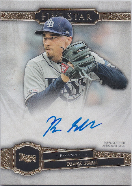
Blake Snell has pitched an entire season with the Padres. The Rays traded him to the Padres in December of 2020. A whole year later and Topps is still making Blake Snell cards on the Rays. I was going to have a hard time deciding whether to collect his autographs after he started appearing on cards as a Padre. Luckily, it seems that Topps has kicked that can down the road to some degree.
Incredible.
Here is my newest Blake Snell autograph from Five Star.
Five Star is one of those products that is a $200 pack of cards with two autographs. The cards have on-card autographs and really thick card stock. They are really nice. I'm sure if you land a Mike Trout autograph you are happy you spent $200 on a box of cards. At the same time, I can't imagine paying $200 for a box/pack of cards and landing a $20 autograph of Blake Snell. I'd be irked.
Well, I did not open a $200 pack of cards and I was more than happy to take a $20 autograph off the hands of someone who did. The card is not even serial numbered? Bon jour, case breaker.
Back of the card.
At first glance this does not seem all that impressive. However, Topps typically fills the back of their high-end products with some giant note that starts with the word, "CONGRATULATIONS" in all caps. I like the "Five Star Career" with 5 important accomplishments/highlights from Snell's career. Really nice touch by Topps to actually do something interesting with the card back here.
The first half of the 1990s were not good years to be a Cardinals fan. I feel like I say that every week on my Random Ray posts. The team typically featured a combination of older, inexpensive players who were past their prime and younger prospects who did not pan out for various reasons. It really all boiled down to the fact that the team's owner, August Busch III, was really cheap and did not care about the team.
That all changed after the 1995 season. The team was sold to the current ownership group and they actually tried to improve the roster by adding good players. Before the 1996 season, the Cardinals signed or traded for Ron Gant, Andy Benes, Royce Clayton, Gary Gaetti, Luis Alicea, Todd Stottlemyre, and Dennis Eckersley. I am probably forgetting some people.
Do you know how nice it was to find baseball cards of Ray Lankford pictured alongside baseball players who were actually talented?
This card was in Series 1 of the 1997 Collectors Choice set. Many of the Cardinals photos for Series 1 were taken during the team's first few games of the 1996 season against the Mets in New York. Note the blue dugout and orange handrails in the background. The picture looks like its following a Ron Gant home run. A quick flip through the box scores from the 1996 Cardinals shows Gant homered in the second game of the season against future Cardinals closer, Jason Isringhausen.
Always nice when you can track a picture down to a specific game and event.
Back of the card.
I am not a big fan of overly busy card backs that are crammed with a lot of information. However, Upper Deck seems to make this one seem decent. There are a decent amount of stats, a nice write-up about Ray Lankford, and I dig the "Did You Know" trivia/factoid at the bottom. The highlight on the card back is the picture at the top. Interesting that Ray Lankford is wearing Dmitri Young's batting helmet.
Dmitri wore 24 for the Cardinals in 1996 and 1997 and was a switch hitter. Given Ray is wearing a batting practice jersey and gray pants, I am guessing this is from a Spring Training game and the team packed lightly. I don't think the veteran players even appear that often in the road games in Spring Training.
Overall, a nice card. Love these Collector's Choice cards.