Triple Play was for the kids.
I was a teenager in 1993, but I collected these cards. I have a ton of them thanks to my summer job the following year. I spent my time away from school that year pushing in grocery carts and occasionally bagging. I could also check on Sunday before the liquor aisle opened up at noon. Inside the front door of the store there was a small customer service counter that sold high-end liquor, candy bars, cashed checks, and had a few boxes of neglected baseball cards.
My parents shopped at the store where I worked when I was a kid and I remember buying baseball cards there all the time. Apparently at some point in between my childhood and high school, buying baseball cards at the grocery store fell out of favor. Honestly, I had stopped by cards there myself in favor of the Ben Franklin that was a short walk from my parents work.
The cards were all at least one year off and all were discounted. Triple Play cards were really inexpensive when they were current year, but the grocery store charged forty cents for a pack the summer I worked there. I know they were not that cheap. Triple Play had a small checklist and there were a healthy number of cards in each pack, so I have the whole set.
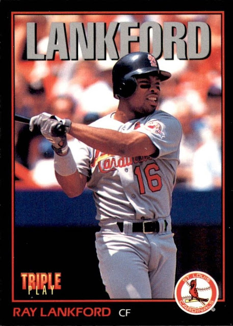
Here is the Ray Lankford.
I really like the black borders with the warm red and orange colors used on the card. The photo is also above average for a "kids product". Given the proximity of Lankford to the stands and dugout, I am guessing he is standing on the on deck circle here. I would venture to say this is in Shea Stadium. The dugouts were blue and had a really thick roof.
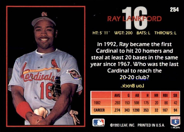
Back of the card.
Love the set up here with the color photo taking up roughly half the back and the stats and write up filling in the other half. The portrait photo is nice. I like how the player uniform number is included in the background behind their name. I was wondering if it was taken at the same time as the picture on the front or if this is a photo day special from Spring Training. Both road uniforms, his batting gloves and bats look used, rather than something staged.
The stat line is small, but this is geared towards kids so I understand keeping it simple. Nice little fact box for Lankford that is teamcentric. It's better than some of the cards that have quotes on the back.
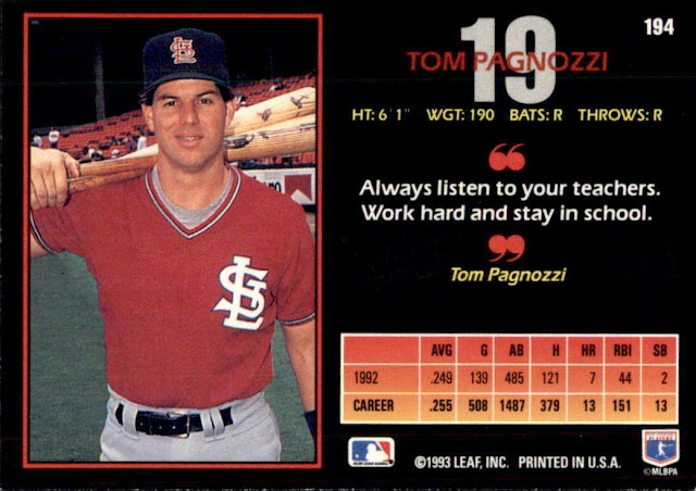
Tom Pagnozzi says.......
Yes, stay in school, listen to your teachers, and work hard. No, I do not think Tom Pagnozzi actually said that to anyone who worked on making this set of baseball cards.


I like this design a lot better than I did the previous years. The black looks many times better than the red (reddish orange?) on the 1992 set.
ReplyDeleteCompletely agree. Those orange borders were a little much. You could line them up and use them to line airplanes.
DeleteIn 1993, I was in college, unemployed (the LCS I worked at closed its doors), and out of the hobby... so I didn't see or buy any of this product. I might have opened a pack decades later (as part of a repack) and have definitely seen singles pass in front of me over the years. Honestly... not as "kiddish" as some of those other "just for kids" products.
ReplyDeleteThe first year of the product with the orange borders were much more obviously designed for kids. This set and the year after were much more grown up and had broader appeal.
DeleteGreat blog I enjjoyed reading
ReplyDelete