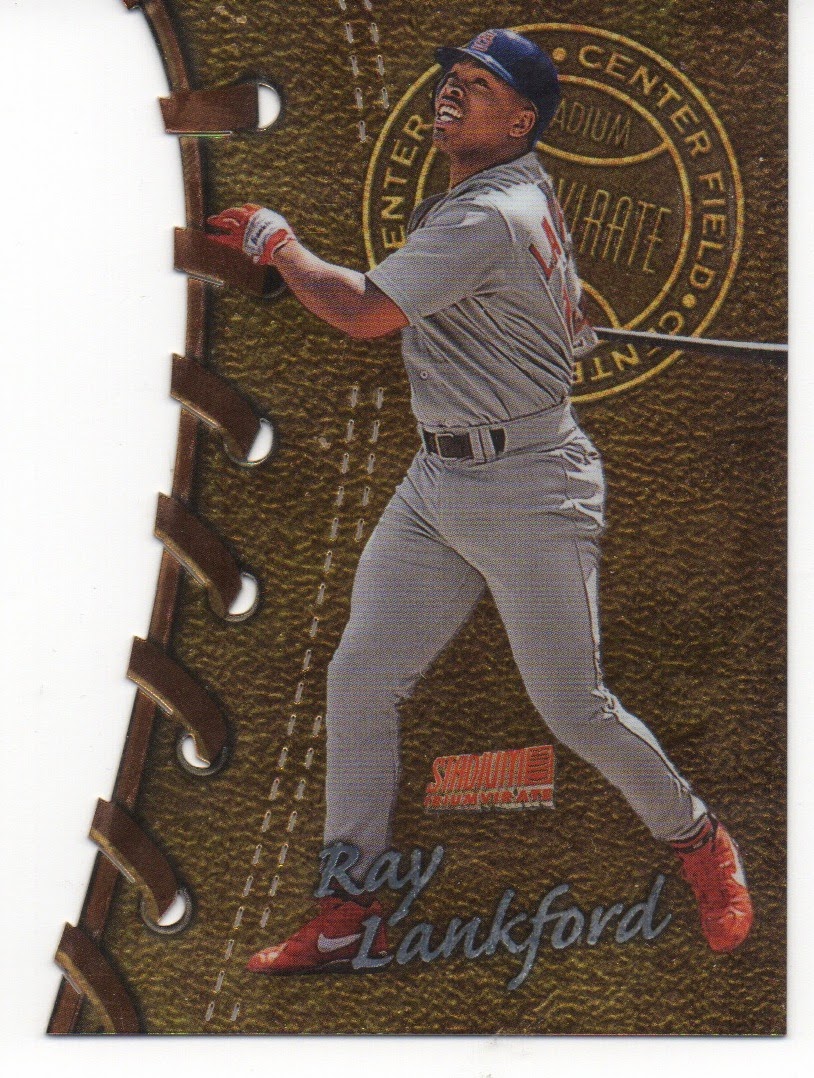
The cards looked good without being assembled into a set. Here are a few of the past designs along with my opinions (generally good) of the cards. Cards are posted in order of date, not favorites. They are all cool cards......
The 1998 set was one the Triumvirate set where the "sets" were by position. You can see the centerfield label behind Ray Lankford. I believe there is also a Bernie Williams card in this set and a Ken Griffey Jr. The Junior might be lingering somewhere in my collection, but I am going to go out on a limb and say I do not have a Bernie, or his soft rock guitar. This year had a simpler die cut, although the lace eyelets around the edge of the cards are actually holes in the card. In a lot of ways this is the set which most reminds me of the new version issued by Topps in 2013 in terms of the shape of the die cuts.
The 1999 version of the Triumvirate cards featured more intricate die cuts and the cards had slats cut into the cards. I have never been into graded cards, but I was also tempted to send a few of these off to see what they would rate. While the cards are generally plastic, I have seen these cards with dings on the points in the die-cuts. The "sets" were by team in this issue.
In 2000 Topps issued a simpler version of the Triumvirate cards. The cards still had the slats, but the edges had a less complex design. I really liked the background on the 2000 set.


I love Stadium Club. They are bringing it back!
ReplyDelete