Here's a run down of one cool card from each of the National League teams 1991 style. No Brewers, yes Astros. After much thought and consideration: No words, just pictures. These were awesome cards.
Sunday, August 17, 2014
1991 Topps: The National League Teams
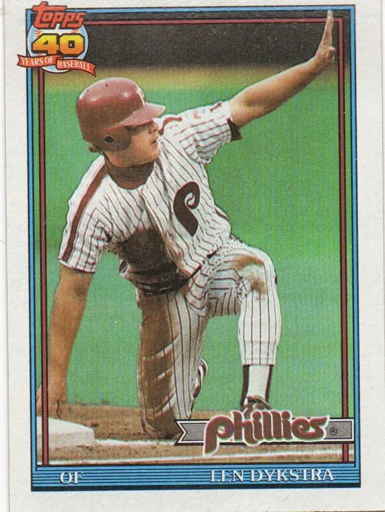
One of the most underrated sets of all-time is the 1991 Topps set. The packaging of the product celebrating the 40th Anniversary of the base Topps set. The design of the cards was really simple with a simple white border, a colored frame to match the team color, and a Topps 40th Anniversary logo up in the top corner of the card. The photography was great. Cool action shots to go along with some really good staged photos. It seemed like Topps actually cared about their cards. Strange.
Here's a run down of one cool card from each of the National League teams 1991 style. No Brewers, yes Astros. After much thought and consideration: No words, just pictures. These were awesome cards.
Subscribe to:
Post Comments (Atom)
106.
Blake Snell number 106 is just a red herring to make two other announcements. Announcement #1- I have not written very often in this sp...

-
Blake Snell number 106 is just a red herring to make two other announcements. Announcement #1- I have not written very often in this sp...
-
First post of the year, got to post the goals to give myself a little bit of direction in 2020. I do well when things are written down. He...
-
1960 Durham Bulls Background- Andy Kosco is a bit of a local legend in Youngstown, Ohio. He excelled at football, basketbal...
No comments:
Post a Comment