Tuesday, March 18, 2014

2014 Topps Heritage Base Set

Last post for a few days on the 2014 Topps Heritage set.  I love the base set for this year's set which is based on the 1965 Topps design.  Pretty spectacular looking cards and I really am looking forward to seeing this set put all together.  Here's my quick spin through this cool looking set:


Again, the base set borrows the design from the 1965 Topps set.  One of my personal vintage favorites.  There are some great looking cards in this set, but the Eric Sogard is really cool.  The glasses of Eric Sogard are highly underrated and are cool to see on a baseball card.  The set also features some players showing off some cool hair. 


My personal favorites are the Bryce Harper comb over and the Colby Rasmus mullet.  Harper always seem to have cool hair.  We've gone from mohawk early on in his career to this...Well played.  Colby I am not so sure about.  The hair looks like something from Kenny Powers.  Perhaps Colby has a future as a gym teacher in North Carolina.  


There are also cool prospects cards in the set.  Both Enny Romero and Tim Beckham had rookie cards long ago, but it's nice to see a pair of Durham Bulls players on the same card.  I believe all of the teams have a pair of prospects in the set.  The Cardinals have a prospects card with Kolten Wong and Audry Perez.  They also have a split prospect card featuring Kevin Siegrist and Giants prospect Heath Hembree. 


The League Leaders cards are cool too and a great copy from the originals in the 1965 set.  The backs are cool too and again a great copy.  Sorry I did not put a scan up on the back of the card.  


The World Series cards are also a great throwback to the 1965 Topps set.  Well, the Cardinals won the 1964 World Series so the final outcome of the cards in the 65 set was better.  There are still good cards in the Heritage set for Cardinals fans.  I like this Wacha card from Game 2 of the Series.  


There are also some great update cards in Heritage.  Plenty of players in new uniforms and Topps actually did a pretty good job on these cards.  Yes they are airbrushed, but they are well done.  It was nice to see a Jhonny Peralta and Peter Bourjos in a Cardinals uni. 

Monday, March 17, 2014

2014 Topps Heritage: High Numbers Varitations

Sometimes when I am working with Topps cards I feel like I could write a whole novel on the different variations that they put into their sets.  I had heard bits and pieces about codes and errors made on purpose, but I decided to stay above the madness of it all and walk into my Heritage boxes a blank slate.  I got my two boxes of Heritage from Big D's Cards, in Raleigh, North Carolina, last Saturday.  Luckily the owner Jimmy had seen a few boxes opened before I opened my boxes, so he was able to walk me through some of the different variations and help me out as I went through my box. 

Here's a few of the different variations that landed in my boxes:


The Heritage Chrome cards are the easiest variation to identify for obvious reasons since the finish of the cards is different from the base cards.  Topps has had the Chrome finished Heritage cards in every set since the inception of Heritage.  There are always two types of Chrome cards.  The Longoria Chrome card above is the base.  The card is serial numbered to 999, and if you are good at spotting it, this card is not a refractor.  The Ian Kinsler below is a refractor.   Note the "shinier" finish on the card and the word refractor appears just below the card number on the back left-hand side of the card.  The serial number is also lower. 


Within the Heritage Chrome cards there are more variations then shown.  The primary variation most popular with collectors are the black framed copies of these cards which are limited to a print run of just 52 cards.  Really great card to find for younger players, but also a good add to your collection if you have a favorite player in the set.  On to the really fun variations and high numbers:


The most common variations can be determined by reading the code in the bottom right hand corner of the card next to the MLB logo.  Base cards have the last three digits of 119.  Anything that is a short-print, variation, or inset has a different number.  The Anthony Rendon card above is a short print.  Flipping the card on the back and focusing in on the code shows a 123:


All of the high numbered short prints in the set feature this code.  While it strains the eyes slightly, and sounded annoying at first, I actually like the idea of having the code on the back.  It's a really quick way to identify the short prints in this set without consulting a checklist every time you open a box or sort a stack of cards.  My two boxes had a big handful of short prints.  I traded one to Jimmy at the card shop for a sweet Prince Fielder Finest Orange card numbered to 99.  I will put a picture of it up on my Facebook page later tonight. I pulled two cool variations out of my boxes.  First, an action variation of Derek Jeter:


The action variations have a code of 126 as the last three numbers on their code and are seeded about one per box of Heritage.  Pretty nice cards and they seem to be fetching a pretty penny on Ebay.  Anybody like Derek Jeter?  I also picked up a mini-variation of Giancarlo Stanton


Mini.  I was surprised to pull a mini and did not even realize that Topps was using minis in the Heritage set this year.  These cards a tough pull at 1 per every 220 packs.  The card is serial numbered to just 100 copies:


Topps has a few other variations which I did not manage to pull.  The three other biggies are the error cards which I hear mangle the spelling of Pittsburgh and the spelling of Kevin Correia's name.  Pittsbufgh, or something like that.  There are also throwback jersey cards and throwback logos.  The variaitons and short prints actually seem this year.  I will see if I can pick up a few others.  Anybody on Jeter? 

Sunday, March 16, 2014

2014 Topps Heritage Hit Cards

I picked up a pair of Topps Heritage boxes this weekend at my favorite local card shop Big D's in Raleigh.  The boxes of Heritage have been pretty popular and the cards are wildly popular online, so I was eager to bust open my packs and see what was inside.  There are plenty of things I could say about the set, but it's honestly a lot to take in on a post.  I broke down the new Donruss cards in a post, but I don't think I could do Heritage justice in a single post.

So, I am breaking my Heritage boxes into three posts (really four, but read further).  Tonight I will show off my two hit cards, one from each box, and then I will have one post about short prints and variations and another about the base set.  Without further ado, here are the two hit cards:


This Dave Vineyard card was the hit out of my first box.  You're scratching your head?  I was too.  Dave did not play too long.  In fact he played only the 1964 season and appeared in the 1965 Topps set.  One of the cool things about the new Topps Heritage cards is the amount of older players included in the autograph set.  In fact, separate post, I already traded for another autograph of an old time Cardinals autograph.   While I could have done much better than Dave Vineyard it is still a really cool card and I am not sure it's worth my time to sell.  Maybe someone will trade for the card.  If not I will file it away and be fine.  


My second hit card was this awesome Fred McGriff Cubs jersey card.  I remember the Crime Dog as a Cub, but it was not his finest moment.  Somewhere in a storage closet at Topps they had an extra Fred McGriff Cubs jersey hanging up.  Let's put it in a set?  Yes.  This card has already been pacakged up, traded, and is en route for a Cardinals card of similar design.  Since there is only on Cardinals card in the Clubhouse Collection set (it's Wainwright) it won't be hard to figure out the player in an upcoming post.  More Heritage tomorrow night.  


2014 Donruss Box

I have been a little intrigued over the past week or so by some of the posts other bloggers and collectors have made about the 2014 Donruss set.  The design of the set and different card elements within the set are very reminiscent of the old 1980s Donruss set.  The only real draw back is the whole Panini thing.   It's not a state secret that I am not a huge fan of the Panini, non-licensed, card releases.  Well, I decided to go for it and picked up a box of 2014 Donruss from Big D's Card Shop in Raleigh.  Here's a break down of the cards:


The base set of the 2014 Donruss cards have a white border which was common on the earlier 80s Donruss sets.  The logo at the top is also an older design of the Donruss logo.  The colored lines on the logo are new, but the card has a good early 80s feel to the card design.  The baseball design on the side of the card is almost identical to the 1987 Donruss cards.  


Many of the elements from the back of the old Donruss cards are also visible on this new relaunch.  Not perfect, but close.  The number in the corner in a baseball, the full name, and blurb at the bottom are all consistent with the 1980's Donruss cards, but the stat box used to show five years of stats, not just one, and the player's contract information was posted in between the stats and the blurb on the bottom of the card.

The 2014 Donruss set is a 200 card set and the box was really well collated.  I did not complete the whole set, but some of that had to do with short printing.  Really I had very few dupes out of my box and could easily spend a small amount of time on Ebay or COMC and have the rest of the set finished quickly.  The biggest pieces missing from my set come from the first 30 cards which are the Diamond Kings cards.  Just like old times....


These look a lot like the original Diamond Kings cards.  I am not sure if the Diamond Kings cards are advirtsed as a short print, but I only pulled five of them, plus a jumbo Diamond King.  The other cards at the beginning of all the Donruss sets?  Don't scroll down...


The Rated Rookie.  There is a good mix of prospects in this set and these cards seem like they might also be slightly short printed.  Some of the pictures seem like they might be Minor League pictures too which is totally cool in my book.  I am taking this Billy Hamilton card as a picture from the Louisville Bats.  Way cool.  There are also is a picture of Chris Archer wearing a Durham Bulls uniform.

Overall the 2014 Donruss base set is excellent.  If you did not collect baseball cards during the 1980s this set may not be for you, but the good vibes generated from cards is well worth the price of the box of cards.  Yes, I bash Panini for not using logos, but I was not even looking at that while I was opening these cards up out of these packs.  I saw that Adam Dunn card and thought about him oleing some ground balls at first base.....


and not the fact that I could not see the White Sox logo on the front of his jersey.  Of course there is so much more to the 2014 Donruss set than just the base set.  Let's look at some more cards.


There are Rookie cards.  The Rookie insert kind of look like the 1988 Donruss cards, but that's a stripe and not a plaid design.  I love the Beckham card on the right.  Durham Bulls uni?  I vote yes.  Again, these cards were a part of the early Donruss years right down to the little logo in the corner.  


There are some elite themed insert sets complete with serial numbers.  A classic of the early 1990s.  The scanner did not do these cards enough justice.  The have a cool foil finish.  Both sets are serial numbered out of 999.  I believe that there are autographed versions of these cards.  


There are also the usual jersey cards.  The Moore card is cool.  I am not sure about Jordan Lyles, but why not.  It's got a pinstripe.  There are also some cool autographs...


Really like the Gausman autograph.  He seems like a really good pitcher and the Cobra is also cool to land.  There are a few Donruss autographs that I will have to chase down now that I have opened my box.  Namely, Kolten Wong.  

The set is not a complete throwback to the 1980s and 1990s Donruss sets.  Panini also borrowed a few elements from the first Donruss relaunch which took place in 2001.  The cards were definitely a 2000s set with autographs, serial numbers, and a lot of foil and gloss.  Here are two cards that fit the 2000s Donruss mold:


The Press Proof cards actually started in the late 90s, but they became really prevalent in the early 2000s.  Pinnacle used the Press Proof concept across their card brands beyond Donruss which made the concept get old really fast.  Search out Press Proof on Ebay and your screen will be littered with a rainbow of different colored Press Proofs from Donruss, Donruss Elite, Leaf, Leaf Certified, Leaf Cuts, Playoff, Playoff Prestige, etc, etc, etc, etc.  


Panini also used the Stat Line cards.  Slightly cooler than the Press Proof cards, but still a product of the 2000s Donruss relaunch.  Player collectors really like these cards, I have dozens of these for Ray Lankford, and they create a good chase.  


Saturday, March 15, 2014

Tip of the Proverbial Iceberg

I spent my morning doing work for my day job, but broke away midday to stop by my favorite local card shop Big D's Cards in Raleigh North Carolina.  I had picked up a few cards over the past few weeks that the owner Jimmy had been holding onto for me, plus added a few other things to my collection while I was in the store.  I sat down and watched the NC State/Duke basketball game and sorted through the cards and had to come up with a plan of attack to post all of the goodies that ended up in my collection this afternoon.  Just like the past two weeks have been filled with plenty of 2002 card sets, after sorting out all of my 2002 baseball cards, the next week might be all about one trip into the card shop.

Let's get started first with some of the single cards I picked up today.  As discussed in previous posts, one of the best parts of having a local card shop is the fact that you have an extra set of eyes and ears to help you build your collection.  I leave my house around 6:30 each morning and get home some time in between 5:00 and 5:30.  During my work day I miss out on all sorts of cards.  No problems, my card shop has my back.  So, the first card I added to my collection I saw about two weeks ago on the Big D's Facebook page:


I have really enjoyed watching Machado the past year and a half and not added many Machado cards to my collection.  I did pick up one Bowman autograph last year, but that was a sticker autograph versus this awesome on-card signature.  I sat on the card for a day and was not sure I was going to pick it up, but then Jimmy posted another incredible autographed card, which I decided to bundle together with this Machado.  My other card:


Yes, it's a Longoria autograph which is always on my radar, but that patch piece is incredible.  Just filthy.  I had to add this card to my collection and was happy that Jimmy gave me a chance to add this card to my collection.  I have Longoria autographs, but I do not have one with this cool of a patch piece.  In fact, I am not sure I have a Longoria card with this cool of a patch piece.  Besides picking up these two cards, I also did a little bit of wax.  That's for a few other posts, but before I left I picked up one more cool single card:


This card is a Topps Vault card which is the front proof for Longo's 2010 Topps Opening card.  I added a Leslie Anderson card like this a few months back.   Jimmy had picked up a lot of Longoria cards over the past week and still had this card leftover from the lot.  I am not huge on one of ones, but I do really like some of the stuff on the Topps Vault and it was well priced.  It came with the usual paperwork from Topps.....


While I only picked up three single cards for my collection today I felt like I came out really well with these cards.  All three are really great adds and would have made my day at the card shop if they had been the only card I had picked up that day.  Adding all three at once was awesome.  A tip of the cap to Jimmy for looking out for me and helping me add some amazing pieces.  If you live in North Carolina a trip to Big D's is a must, or if you are somewhere else in the country be sure to follow Jimmy on Twitter or Facebook. 

Thursday, March 13, 2014

and you left St. Louis because?

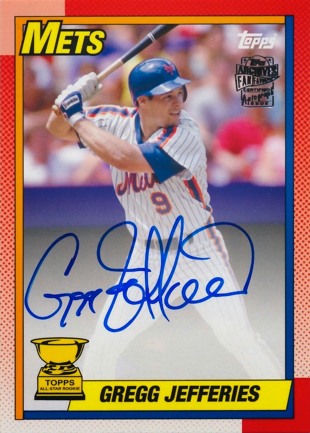
There are some players who just play really well in certain places or against certain teams.  I remember about ten to fifteen years ago the Cardinals could not touch Glendon Rusch.  A similar thing happened more recently with Astros pitcher Bud Norris.  No explanation for it, just the way it seemed to work.  Of course, there have also been players who have been great in St. Louis and no lived up to expectations in other places.  One of the better Cardinals of the mid-to-early nineties was one-time Mets phenom Gregg Jefferies.  I recently picked up an autograph of the long-time Major Leaguer.


This card comes out of last year's Topps Archives set and features a great on-card autograph.  If you are not familiar with Jefferies, he was a very talented Mets prospect in the mid-to-late 80s.  Jefferies never really lived up to potential with the Mets and he showed a lot of "immaturity"  


The Mets shipped him away to the Royals in exchange for Brett Saberhagen and then a year later was traded away to the Cardinals for Felix Jose.  Jefferies entered his Cardinals career with a career OPS+ a few points over 100.  His career high for WAR was 2.7.  All of that changed after Jefferies showed up in St. Louis.  Sure he still slammed his batting helmet into the ground and played with a lot of fire, but also posted career highs across the board.  In 1993 Jefferies posted a career high 5.1 WAR with a .348/.408/.485 line.  His OPS+ was 142.  His numbers slipped slightly in 1994, but still posted .325/.389/.489 line.  Add in two All-Star game appearances.  Pretty good.  

For whatever reason, Jefferies signed at the end of the 1994 season with the Phillies.  He also spent some time with the Tigers and Angels at the end of his career, but never came close to reaching his numbers in St. Louis.  More of a glorified utility man.  Plus, Pedro apparently could not stand Gregg.  The sound Jefferies makes when he gets beamed in this video is outstanding.  


Wednesday, March 12, 2014

Flags Have Limits

I have been putting the finishing touches on sorting out my 2002 baseball card sets this week.  It was a pretty good year in general, but one of the great things about going back through old card sets is finding the flops.  One set which has aged terribly in my opinion is the 2002 Studio set:


The cards are pretty patriotic to say the least.  I do not have a problem with flags, but there is something about these cards which reminds me a little bit of the Rex Kwon Do guy from Napoleon Dynamite.  If you've never seen the movie here's your clip:

)

Each card features an American flag and the small film frames behind the players feature the skyline of the city they play in.  I thought the Arch was pretty unique, so I am going with Bud Smith.  So, here's where this set takes a strange twist.  Also featuring American flags:


The Expos are American?  Hmmmm..


Of course the Blue Jays also have a cool American flag on their cards too which seems to not fit too well with the skyline of Toronto behind Shannon Stewart.  Donruss bounced back strong with a nice 2003 set featuring the team stadiums in the background.  This set has also one of the old Playoff sets which Panini has revived fairly well without a license. 

106.

Blake Snell number 106 is just a red herring to make two other announcements.      Announcement #1- I have not written very often in this sp...